Presentation Research:
Halo Waypoint. 2021. Halo – Official Site. [online] Available at: <https://www.halowaypoint.com/en-us> [Accessed 20 October 2021].

This is the Halo web page I feel it shows a good example of how to present a web page as it is simple and easy to navigate as you can easily get to pages of key information about halo for example if you wanted to find out about season 8 of MCC whilst also having important information about the release of Halo Infinite in large lettering at the top.
PAYDAY 2 Official Site. 2021. PAYDAY 2 Official Site. [online] Available at: <https://www.paydaythegame.com/> [Accessed 20 October 2021].


This is the Payday 2 website I feel it shows a good example of an eye catching website one way that it does this is by showing the 10th anniversary poster and other things you can look through such as trailers for heists by pressing each dot at the side It also has a section on the page talking about what the game is about and other similar pages talking about some aspects of the game.
Environment, Z., 2021. ZETA HALO Experience – Fan Made Environment by InfiniteForges. [online] itch.io. Available at: <https://infiniteforges.itch.io/zetahalo> [Accessed 20 October 2021].

This is the Itch page for Zeta Halo and shows a simple yet eye-catching web page one way it does this is through a variety of visually appealing screenshots from the game with a contrasting black background and easy to read white text about how to download the game as well as a brief summary of the story. This web page is also a great example as it is an itch page which is the website I will be using and shows an example of things I would be capable of doing on the website.

This is a plan that I have made I have decided to take inspiration from the “Zeta Halo” itch page and use a land scape that fits the theme of my game. I have also decided to have a banner as I think it will make the page look better and seem more eye-catching. I have also decided that I will have pictures of each hole with information about the game so that the player would be able to see what the game looks like and be able to find out a little bit more about the game before playing.
I feel overall that this plan will help me as it has given me an idea on which to form my itch page about.
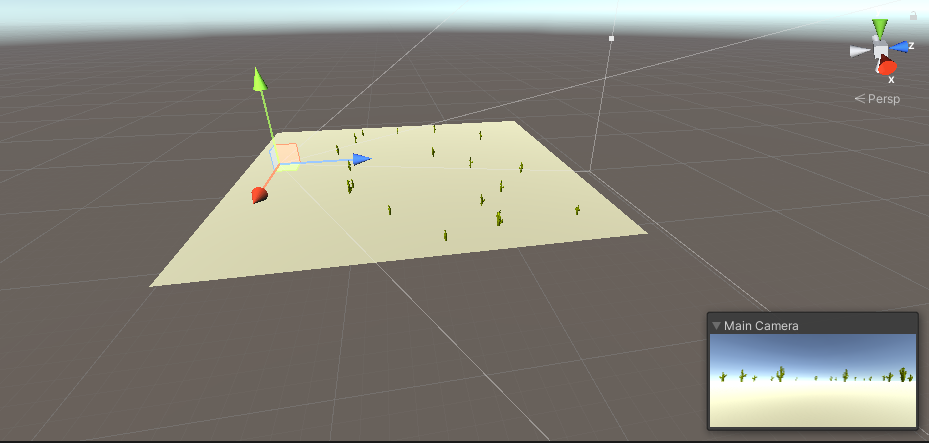
After taking inspiration form the itch page for “Zeta Halo” I decide that I wanted the background to be an environment that shows an environment similar to that of the game to make this I created a scene in unity using a sand coloured plane for the ground and scattering cacti around the scene the image above shows what the scene looks like from a birds eye view and the small box in the corner shows how it looks from the main camera.

I then took a screenshot of how the environment looks and I am happy with how it has tuned out as I think it looks good showing the kind of environments that are in my game and will help to make an eye-catching page with the bright sand, sky and cacti.

When I had put the background on my itch page it did not turn out in the way I had wanted it to as the screen to play the game had obscured most of the image and made it look as if it it were just two separate colours of blue and sand and also meaning that the cacti were not visible as I hoped that they would be visible on either side of the screen to play the game.

After having to change the game to a Downloadable file as I had trouble getting the game to run in the browser, the background looked much better as you could see the whole landscape and cacti on either side of the menu and I am happy with how it turned out as a nice looking and eye-catching background.

I decided to change the font to one that was more fitting to my theme I decided to use a font called “Barrio” as I thought that it fit with the western theme quite well. One issue I have with it is it could get hard to read when reading lots of text such as when I write the description.

After changing the font I added some images to the page for the banner I reused the scene I had made in unity for the background and adding a small logo to the top using the same font and colour from the itch page I feel that it does a good job as a banner and helps to make the page more interesting. another image I added was the cover image to make this I set up another scene in unity and added the same logo that I made for the banner and I feel this cover image does its job well as it is eye-catching and helps to show the theme of my game well.

I then added this section with an image from each course with small amounts of text about the game.
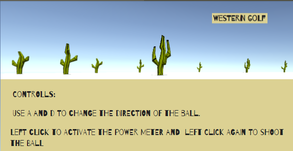
After this I had realised that I did not have a section telling the player how to control the game so I decided to add a small section to tell the player the controls one issue I have with this is that the font although it looks nice and helps the page to fit the theme of my game it makes this section slightly harder to read although it is not much of a problem that I would have to change the font on the page.
I feel that overall the creation of my itch page has gone well as I have created a page that will be eye-catching to the player gives them information on the game and how to control it and also keeps the same theme as the game throughout.
